今天我们开始matplotlib的学习,现在是凌晨00:00,我争取在4:00 之前写完
介绍
Matplotlib是一个非常强大的数据可视化工具,我们之前学习了NumPy和pandas 和 Scipy, Scipy和pandas有一些数据图形化的功能,但是功能很有限而且不美观,很难达到企业级别的要求。而Matplotlib完全满足了这种要求,他拥有以下几个优点:
容易使用 支持用户定义labels 对图表元素的高控性 高质量的输出图像 支持用户编辑
这篇教程只是介绍一些matplotlib的一些常用功能,如果想了解更多高级功能请访问官网: http://matplotlib.org/
安装
pip install matplotlib
下面我们需要import重要的 module
import matplotlib.pyplot as plt
基本操作
首先我们来画一个基本的plot。一个plot需要有x轴和y轴,我们用NumPy建立两个
import numpy as np
x = np.arange(0,5.5,0.5)
y = x ** 2
x
array([ 0. , 0.5, 1. , 1.5, 2. , 2.5, 3. , 3.5, 4. , 4.5, 5. ])
y
array([  0.  ,   0.25,   1.  ,   2.25,   4.  ,   6.25,   9.  ,  12.25,
        16.  ,  20.25,  25.  ])
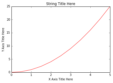
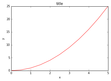
建立x,y轴数据完成,我们可以用他们完成一个简单的plot
plt.plot(x, y, 'r') # 'r' 用红色线条
plt.xlabel('X Axis Title Here')
plt.ylabel('Y Axis Title Here')
plt.title('String Title Here')
plt.show() # 最后一定要用plt.show() 才能显示
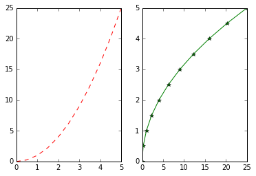
添加多图表在一个plot中
# plt.subplot(nrows, ncols, plot_number)
plt.subplot(1,2,1)  # 建立一行二列的图表组,第三个参数代表第一个图表
plt.plot(x, y, 'r--') # 红色虚线,每个节点用 -
plt.subplot(1,2,2)  # 第三个参数代表第二个图表
plt.plot(y, x, 'g*-'); # 绿色实线,每个节点用 *
Matplotlib 面向对象方法
Matplotlib 有很多面向对象API,所以我们可以增加figure对象
面向对象方法介绍
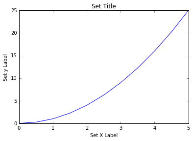
我们可以吧figure看做一个对象,同过matplotlib添加。然后给figure设置各种属性。
# 建立一个空 Figure
fig = plt.figure()

# 添加 axes 到 figure
axes = fig.add_axes([0.1, 0.1, 0.8, 0.8]) # 左,下,宽,高 (range 0 to 1)

# 使用
axes.plot(x, y, 'b')
axes.set_xlabel('Set X Label') # set方法
axes.set_ylabel('Set y Label')
axes.set_title('Set Title')
<matplotlib.text.Text at 0x111c85198>
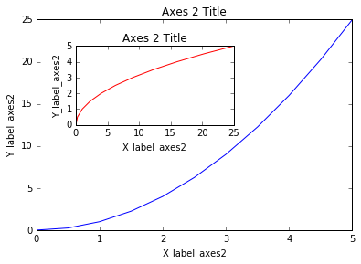
下面我们添加复合图表,代码有点复杂,但是如果写起来会发现很容易控制
# Creates blank canvas
fig = plt.figure()

axes1 = fig.add_axes([0.1, 0.1, 0.8, 0.8]) # 主轴
axes2 = fig.add_axes([0.2, 0.5, 0.4, 0.3]) # 插入轴

# 大的主图
axes1.plot(x, y, 'b')
axes1.set_xlabel('X_label_axes2')
axes1.set_ylabel('Y_label_axes2')
axes1.set_title('Axes 2 Title')

# 小的附图
axes2.plot(y, x, 'r')
axes2.set_xlabel('X_label_axes2')
axes2.set_ylabel('Y_label_axes2')
axes2.set_title('Axes 2 Title');
subplots()
plt.subplots() 将扮演一个自动管理行列的角色
# 用subplots 将会自动添加axes进figure
fig, axes = plt.subplots()

# 一样的
axes.plot(x, y, 'r')
axes.set_xlabel('x')
axes.set_ylabel('y')
axes.set_title('title');
下面我们重复添加多图表的过程
# Empty canvas of 1 by 2 subplots
fig, axes = plt.subplots(nrows=1, ncols=2)  # 一个fig 可以包含多个axes
# Axes 是一个array 当plot 建立时候
axes
array([<matplotlib.axes._subplots.AxesSubplot object at 0x111f0f8d0>,<matplotlib.axes._subplots.AxesSubplot object at 0x1121f5588>], dtype=object)
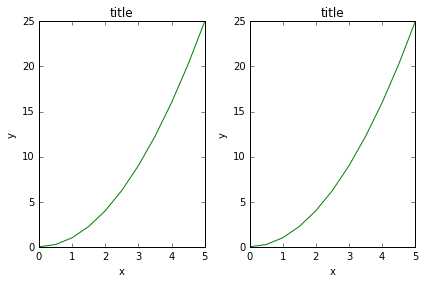
我们可以用循环遍历这个数组
for ax in axes:
    ax.plot(x, y, 'b')
    ax.set_xlabel('x')
    ax.set_ylabel('y')
    ax.set_title('title')

# Display the figure object
fig

可以看出这样才是真正使用到了编程。通过循环建立两个图表 我们总结一下,首先设置了x轴和y轴所代表的变量,然后用plt.subplots() 方法建立图表模型,最后用循环来增加图表,这在实际生活中非常有用,比如需要分别打印一年12个月每个月的销售数据。
我们还可以用 fig.tight_layout() 或者 plt.tight_layout() 方法调整子图表的分布
fig, axes = plt.subplots(nrows=1, ncols=2)

for ax in axes:
    ax.plot(x, y, 'g')
    ax.set_xlabel('x')
    ax.set_ylabel('y')
    ax.set_title('title')

fig
plt.tight_layout()
__
图表的大小,横纵比例与像素
需要改变这三个 我们要了解两个重要的参数 figsize: 一个关于长宽的tuple dpi: dots-per-inch (pixel per inch).
fig = plt.figure(figsize=(8,4), dpi=100)
<matplotlib.figure.Figure at 0x11228ea58>
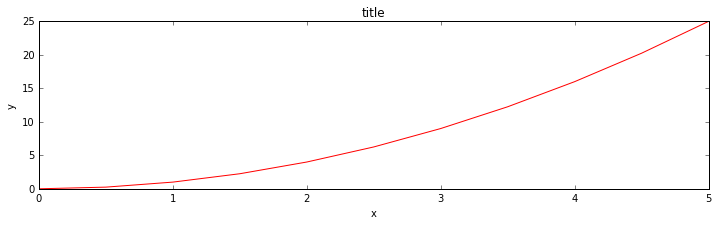
这两个参数可以运用在任何layout管理对象中,比如subplots
fig, axes = plt.subplots(figsize=(12,3))

axes.plot(x, y, 'r')
axes.set_xlabel('x')
axes.set_ylabel('y')
axes.set_title('title');
保存图片
Matplotlib支持保存PNG, JPG, EPS, SVG, PGF 和 PDF格式的图片。例子如下:
fig.savefig("filename.png")

fig.savefig("filename.png", dpi=200)
图例,标签和标题
代码如下所示:
ax.set_title("title");

ax.set_xlabel("x")
ax.set_ylabel("y");
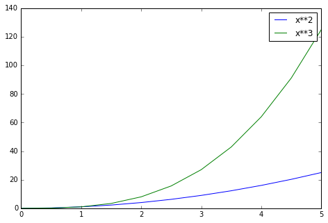
#### 图例
可以用 legend() 在一个图表中打印两条曲线
fig = plt.figure()

ax = fig.add_axes([0,0,1,1])

ax.plot(x, x**2, label="x**2")
ax.plot(x, x**3, label="x**3")
ax.legend()
<matplotlib.legend.Legend at 0x113a3d8d0>
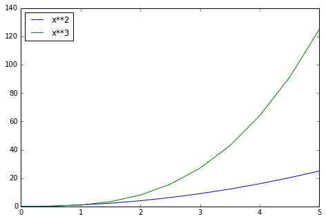
loc 参数可以定义图例位置
# Lots of options....

ax.legend(loc=1) # upper right corner
ax.legend(loc=2) # upper left corner
ax.legend(loc=3) # lower left corner
ax.legend(loc=4) # lower right corner

# .. many more options are available

# Most common to choose
ax.legend(loc=0) # 让 matplotlib 自动决定最好的位置
fig
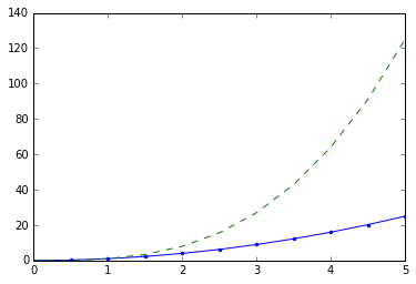
设置颜色,线条长宽,线条类型
颜色可以用字母表示,线条的话如下面代码所示:
# MATLAB style line color and style
fig, ax = plt.subplots()
ax.plot(x, x**2, 'b.-') # b 代表蓝色,后面是带点的线条
ax.plot(x, x**3, 'g--') # g 代表绿色,后面是代表虚线
[<matplotlib.lines.Line2D at 0x111fae048>]
这里有详细的说明: http://matplotlib.org/api/lines_api.html
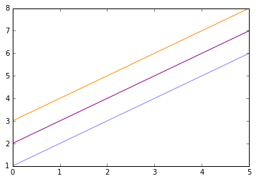
还可以用RGB代码设置颜色
fig, ax = plt.subplots()

ax.plot(x, x+1, color="blue", alpha=0.5) # half-transparant
ax.plot(x, x+2, color="#8B008B")        # RGB hex code
ax.plot(x, x+3, color="#FF8C00")        # RGB hex code
[<matplotlib.lines.Line2D at 0x112179390>]
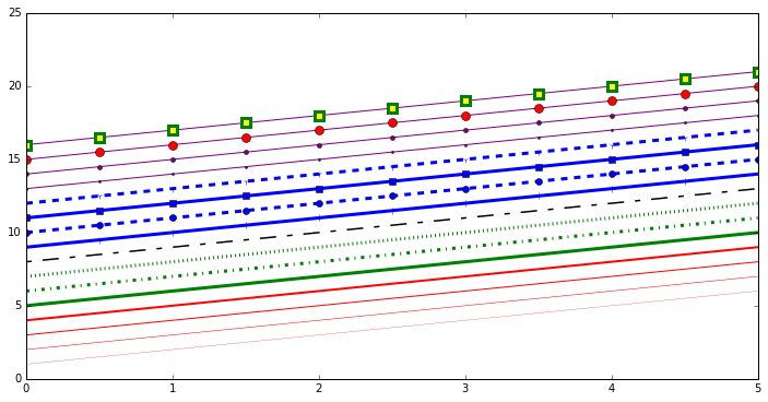
线条和标记风格
线条宽度我们可以用 linewidth 或者 lw 关键字, 线条风格我们可以用 linestyle 或者 ls 关键字
fig, ax = plt.subplots(figsize=(12,6))

ax.plot(x, x+1, color="red", linewidth=0.25)
ax.plot(x, x+2, color="red", linewidth=0.50)
ax.plot(x, x+3, color="red", linewidth=1.00)
ax.plot(x, x+4, color="red", linewidth=2.00)

# possible linestype options ‘-‘, ‘–’, ‘-.’, ‘:’, ‘steps’
ax.plot(x, x+5, color="green", lw=3, linestyle='-')
ax.plot(x, x+6, color="green", lw=3, ls='-.')
ax.plot(x, x+7, color="green", lw=3, ls=':')

# custom dash
line, = ax.plot(x, x+8, color="black", lw=1.50)
line.set_dashes([5, 10, 15, 10]) # format: line length, space length, ...

# possible marker symbols: marker = '+', 'o', '*', 's', ',', '.', '1', '2', '3', '4', ...
ax.plot(x, x+ 9, color="blue", lw=3, ls='-', marker='+')
ax.plot(x, x+10, color="blue", lw=3, ls='--', marker='o')
ax.plot(x, x+11, color="blue", lw=3, ls='-', marker='s')
ax.plot(x, x+12, color="blue", lw=3, ls='--', marker='1')

# marker size and color
ax.plot(x, x+13, color="purple", lw=1, ls='-', marker='o', markersize=2)
ax.plot(x, x+14, color="purple", lw=1, ls='-', marker='o', markersize=4)
ax.plot(x, x+15, color="purple", lw=1, ls='-', marker='o', markersize=8, markerfacecolor="red")
ax.plot(x, x+16, color="purple", lw=1, ls='-', marker='s', markersize=8,
        markerfacecolor="yellow", markeredgewidth=3, markeredgecolor="green");
控制轴的外观
这里讨论如何控制轴的尺寸和外观
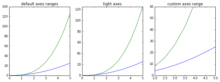
绘图范围
我们可以用set_ylim 和 set_xlim 来控制图表的范围,或者直接用axis(‘tight’)来自动将图表紧凑起来
fig, axes = plt.subplots(1, 3, figsize=(12, 4))

axes[0].plot(x, x**2, x, x**3)
axes[0].set_title("default axes ranges")

axes[1].plot(x, x**2, x, x**3)
axes[1].axis('tight')
axes[1].set_title("tight axes")

axes[2].plot(x, x**2, x, x**3)
axes[2].set_ylim([0, 60])
axes[2].set_xlim([2, 5])
axes[2].set_title("custom axes range");
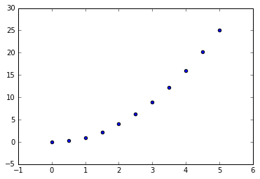
特别绘图类型
下面介绍几种特别的绘图类型,有时候也需要用到
plt.scatter(x,y)
<matplotlib.collections.PathCollection at 0x1122be438>
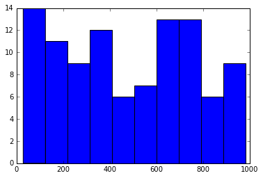
from random import sample
data = sample(range(1, 1000), 100)
plt.hist(data)   # 这个以后将会经常用到
(array([ 14.,  11.,   9.,  12.,   6.,   7.,  13.,  13.,   6.,   9.]),
 array([  28. ,  123.5,  219. ,  314.5,  410. ,  505.5,  601. ,  696.5,
         792. ,  887.5,  983. ]),
 <a list of 10 Patch objects>)
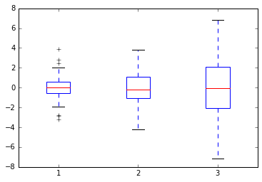
data = [np.random.normal(0, std, 100) for std in range(1, 4)]

# rectangular box plot
plt.boxplot(data,vert=True,patch_artist=True);
最后介绍几个很好的matplotlib的学习资源,对大家很有帮助:
- http://www.matplotlib.org - matplotlib 的官方网站
- https://github.com/matplotlib/matplotlib - matplotlib 源码
- http://matplotlib.org/gallery.html - 所有的图示案例,很重要!!!
- http://www.loria.fr/~rougier/teaching/matplotlib - 一个很好的matpplotlib的教程
- http://scipy-lectures.github.io/matplotlib/matplotlib.html - 另一个很好的参考